Rebrand of the company PHILABUNDANCE
Philabundance focuses on fostering a hunger-free future through community engagement, sustainable partnerships, and innovative solutions, embodying a commitment to eradicating food insecurity. The rebranding of Philabundance is to better reflect its evolving mission and provide a new perspective for the community center.
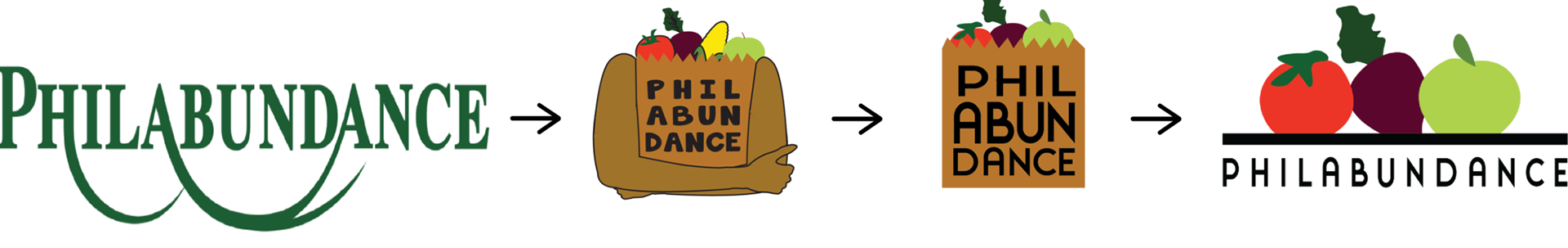
Original logo of PHILABUNDANCE. For the rebrand, I wanted to create a new logo that was representative of their company and mission.
The first variation of the logo was created a this version to bring in a more human aspect that the original logo was lacking.
The variation was too pictorial so I simplified it to the company’s bag and from 4 produce to 3
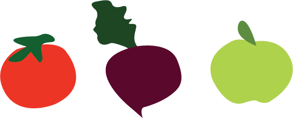
The final logo brought forward the most important part of the company’s brand which is its goal to end hunger
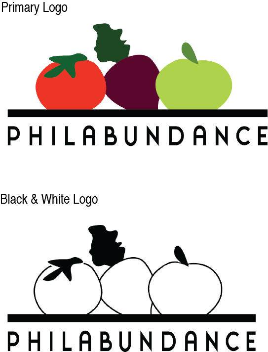

Logo Variations

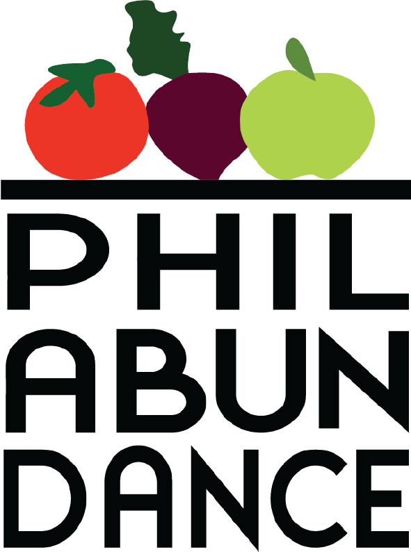
Created two different variations of the logo so that the logo can be used in a multitude of different situations. The stacked logo is for verticle usage such as email sign-offs.
The typographical logo is to stand out and be memorable and used in any case.
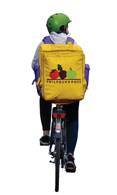
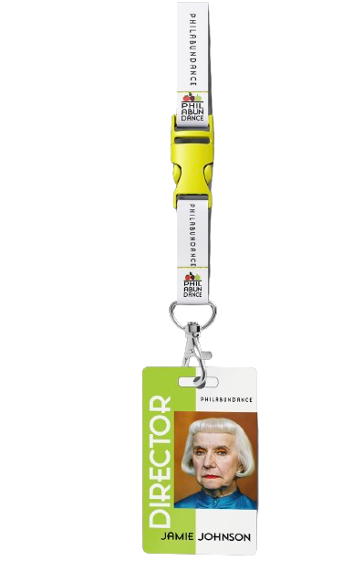
Key Design Elements used for Merchandise and branding
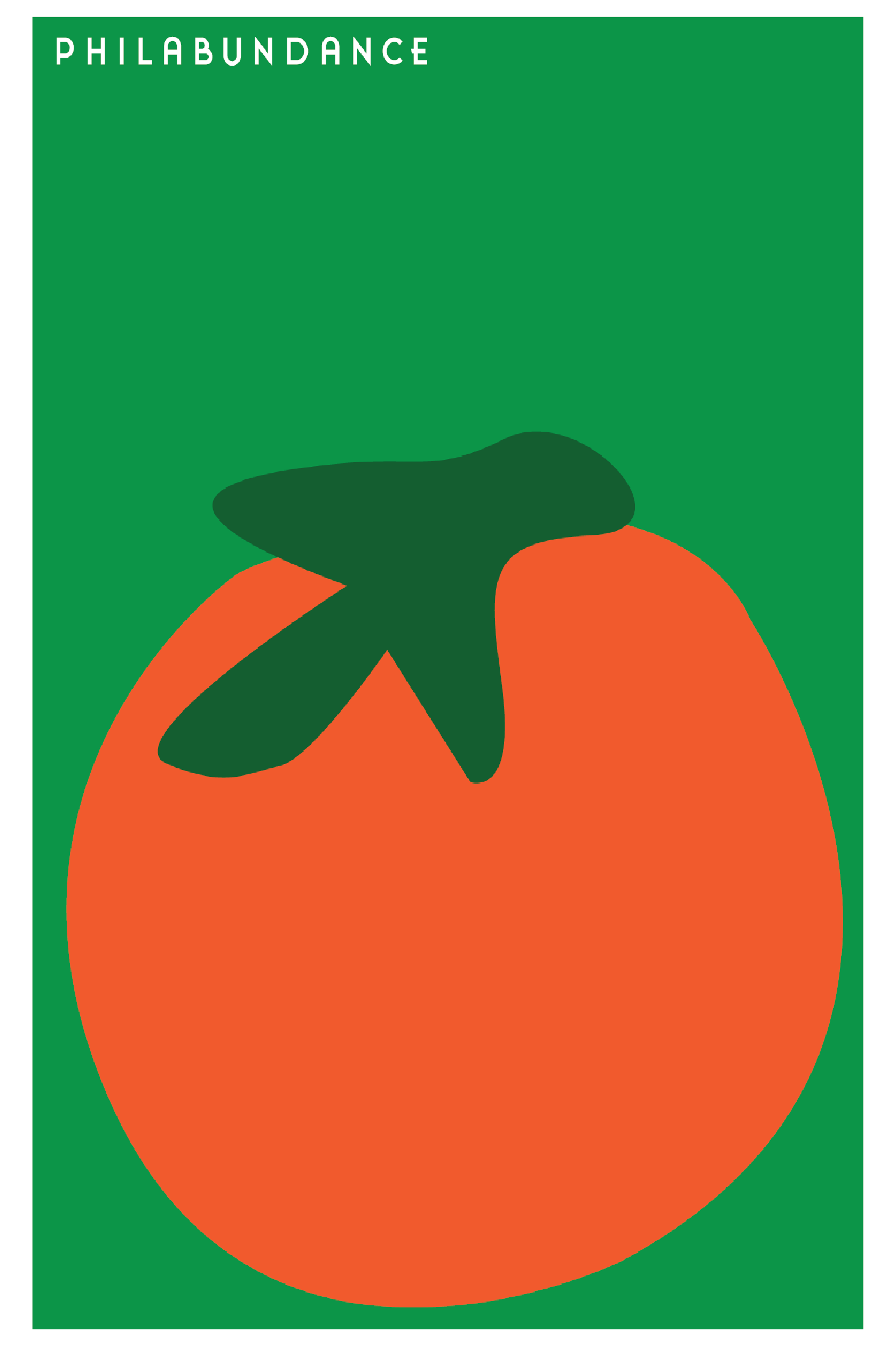
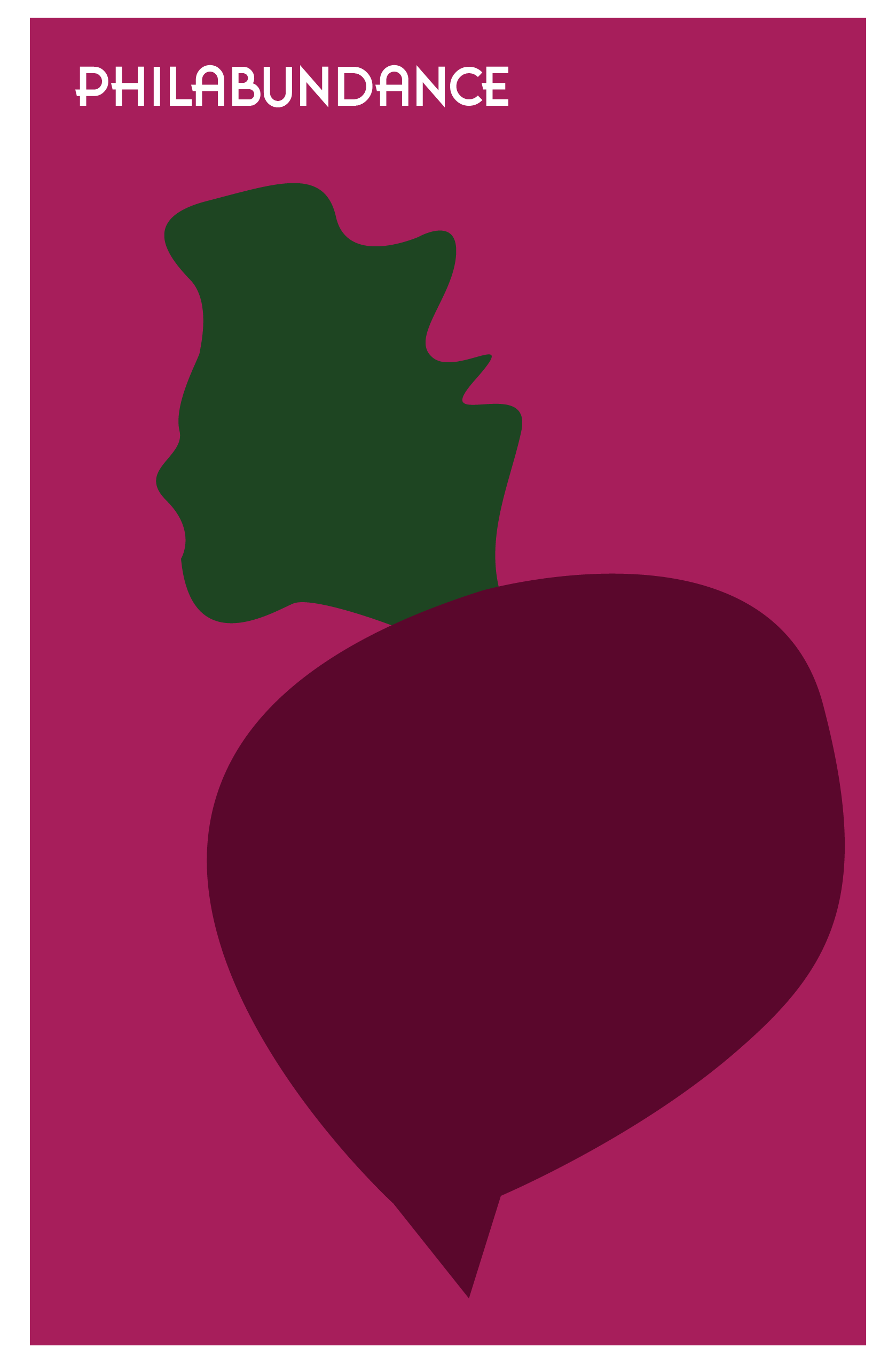
POSTERS
Motion Graphic
Branding Badges & Merch